5 Essential Ways To Win With Great Design For Small Businesses
"Swipe Right" means someone is interested in you.
They might reach out to you, meet up, go on a date, and maybe develop into a beautiful and fun relationship.
"Swipe Left" means "NOPE". You don't even get a chance.
This idea is borrowed from the Tinder app, but a pretty good metaphor for business.
At the core of it is this:
First impressions MATTER.
They matter in relationships, and they matter in business.
LET’S BE HONEST.
You already know that these days people equate good design with credibility and being “legit”.
The reality now is that if you’re not taking advantage of good design these days, you are putting your business at a MASSIVE competitive disadvantage.
If it looks good, they might check it out, but if it doesn’t look good, they may not even give you a chance.
Good design isn't even as much of a differentiating factor as it used to be.
Good design is EXPECTED now.
There is literally SO much noise out there on the internet, that people are VERY picky with the type of content that they decide to sPend their time on and the type of businesses they spend their money on.
If you don't have good design, you'll find it hard to win the game because you aren't even on the same playing field and everyone else.
Think about your Instagram feed:
You probably follow a LOT of very talented photographers, artists, interesting people, but what does your experience normally look like when you use the app?: SCROLL... SCROLL... PAUSE... SCROLL... SCROLL...
Something has to be pretty engaging to capture our attention, otherwise, we scroll right past it. And something has to be REALLY nice for us to decide to click on the profile, much less actually visit the person's website.
Let's take this analogy into the context of your business.
There are a LOT of businesses out there, and EVERYONE is trying to get new customers/clients.
Everyone is sharing their message and inviting people to work with them. But unless we think about the process that potential clients go through before picking whom they will give their money to, we might as well just be shooting in the dark.
People window shop.
They check out your Instagram. They look you up on Google. They look you up on Yelp. They skim your website. And they do all of this without you even knowing.
They basically internet stalk your business.
Most of the time they are looking for 3 main things:
Can you solve their problem?
Do they like you as a person/feel a connection to you?
Are you legit/look like you know what you're doing?
The 1st item comes down to your experience and your ability to display your expertise through marketing and in-person.
The 2nd item speaks to your personality and how well you can transparently share who you are, why you do it, and probably even some of your story.
But the 3rd item is unique because it often gets overlooked by many small businesses who are just starting out.
Either that, or it's a "someday" goal:
Presentation.
There's no question that you can still run a successful business with just experience and personality. You know you've got what it takes to serve people and get results.
But that's often not the problem. Oftentimes, the problem is that people don't know how great you are because they can't FIND YOU.
They can't pick you out from the crowd.
But what if you COULD stand out?
What if you could immediately communicate credibility to potential clients/customers before they ever hear your voice or read a word you've written?
How?
This brings us back to my Window Shopper analogy:
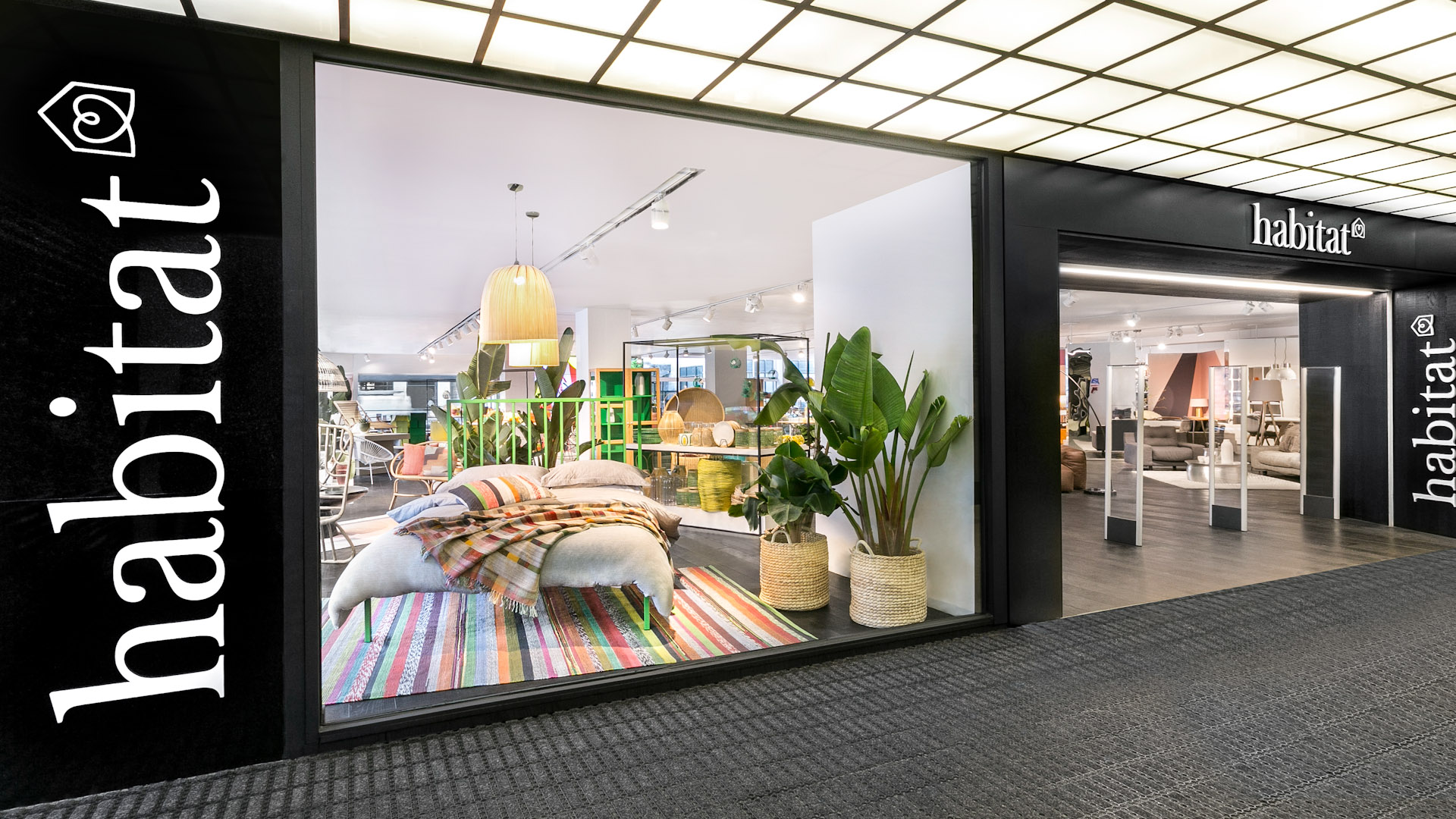
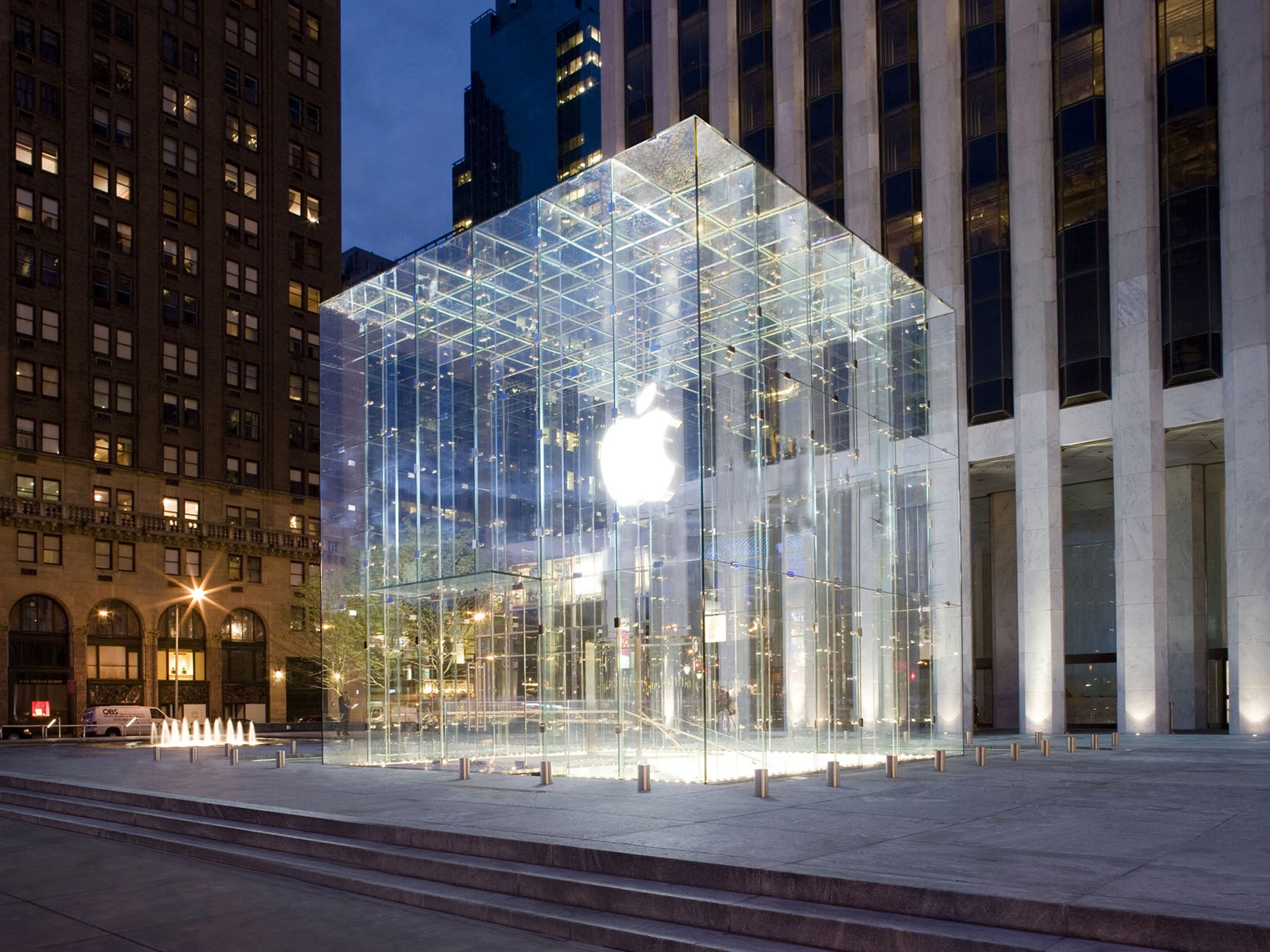
Unless the window display of a store is beautiful, engaging, compelling, and expertly done, people are just going to glance at it and walk by.
But the goal is to get them IN your "store", to connect with them.
And that's not even the whole story!
Once someone is in your store, you still need to build a relationship with them, find out their needs, and then share how you can meet those needs.
BUT, you'll never get the opportunity to do any of this unless the person walks into your store.
You need to treat your business presentation the same way you would if you had a physical store.
You need a kick-butt window display.
Are you going to be the business owner who sits behind the register waiting for someone to walk in, pick something out on their own and then pay us?
That's not good business, that's passive ownership. It's also self-focused thinking,
"If I'm good enough, then people will come to ME."
You can't serve people if you're focused on yourself.
The wise business owner understands the customer's journey.
They know how many other stores are on the block. They know how many signs and lights and messages are out there, so they craft a unique window display that draws people inside.
They know that the event of a customer walking into their store in the first place is ALREADY a victory.
And they know that unless someone comes inside, you don't have a chance of making a sale.
The majority of a person's opinions of you and decisions about your business are already formed before you ever interact with them personally.
Source: RCJ
Look at the diagram above.
Over HALF of a customer's interactions with your brand happen before they decide to actually go to your store/website.
And this model doesn't even display the percentage of people who leave your store/website without buying anything (this includes contacting/booking you if you're a service-based business.)
Here's some eye-opening stats about website first impressions:
(Source: www.sweor.com)
It takes only about 50 milliseconds (that’s 0.05 seconds) for users to form an opinion about your website that determines whether they like your site or not, whether they’ll stay or leave. (See for yourself with this example)
A study found that 94% of negative website feedback was design related.
38% of people will stop engaging with a website if the content or layout are unattractive
75% of consumers admit to making judgements on a company’s credibility based on the company’s website design.
If given 15 minutes to consume content, two-thirds of people would rather read something beautifully designed than something plain.
First impressions are 94% design-related. (ex: Boring design, bad use of color, excessive pop up advertisements, inadequate introductory content, small print, too much text, a corporate look and feel, and an ineffective search feature.)
The same study found that 46% of consumers in the study based their decisions on the credibility of websites on their visual appeal and aesthetics. (This includes website layout, typography, font size and color schemes.)
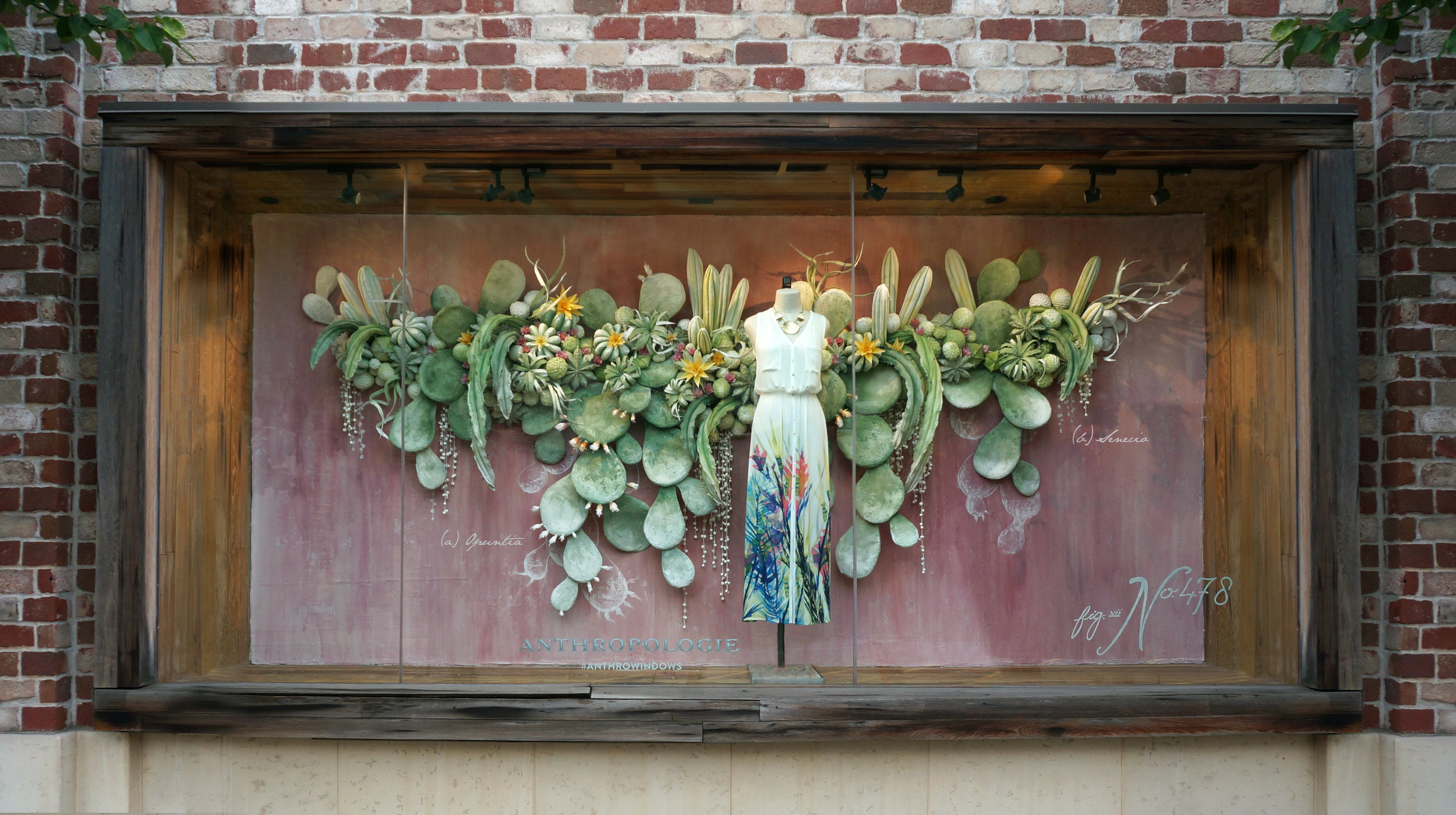
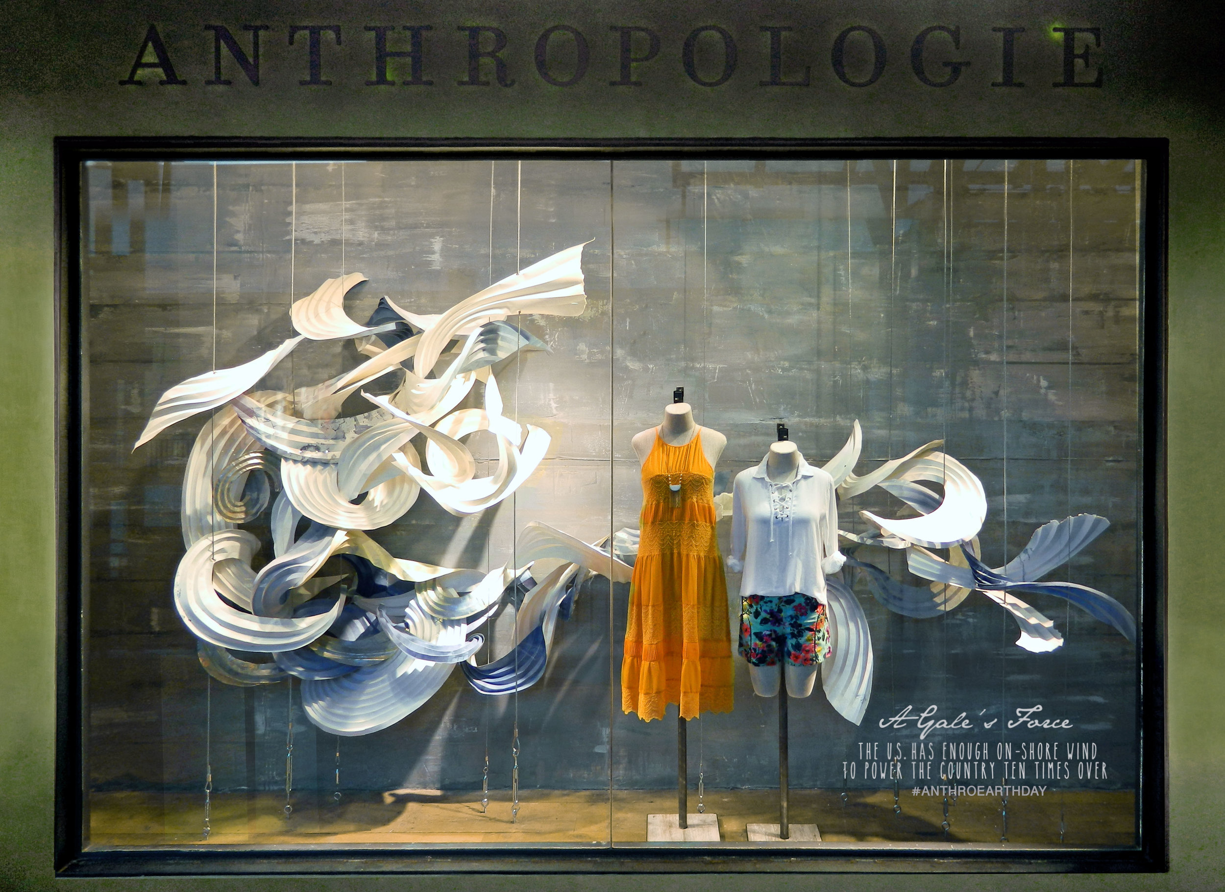
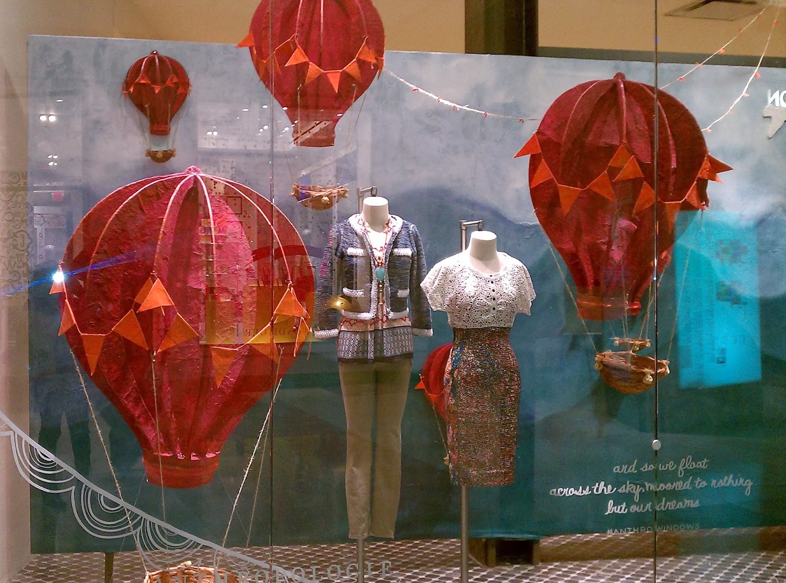
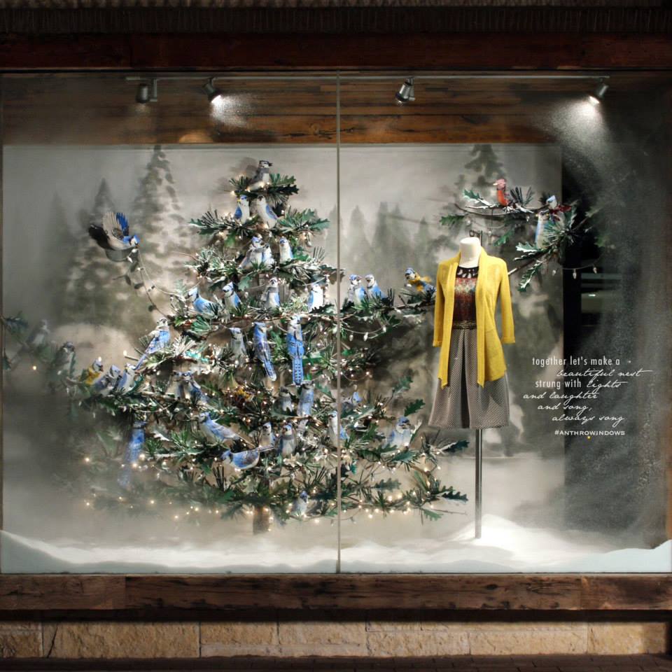
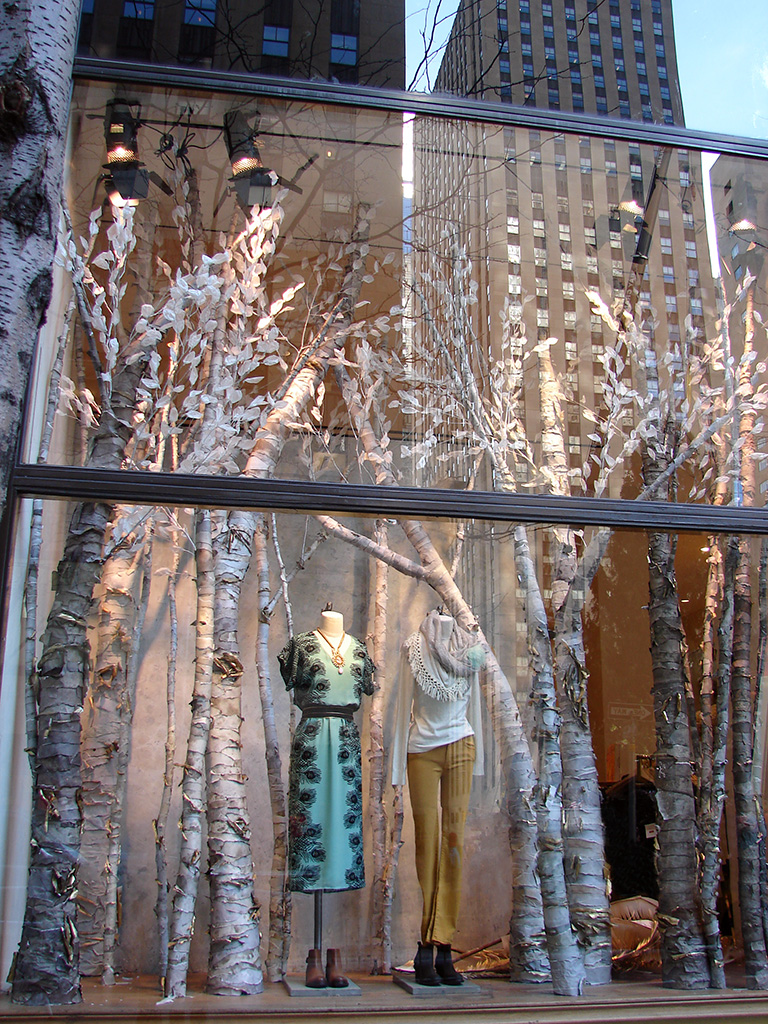
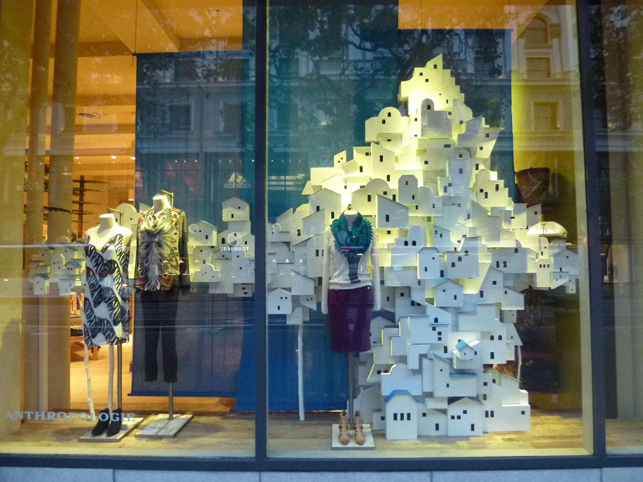
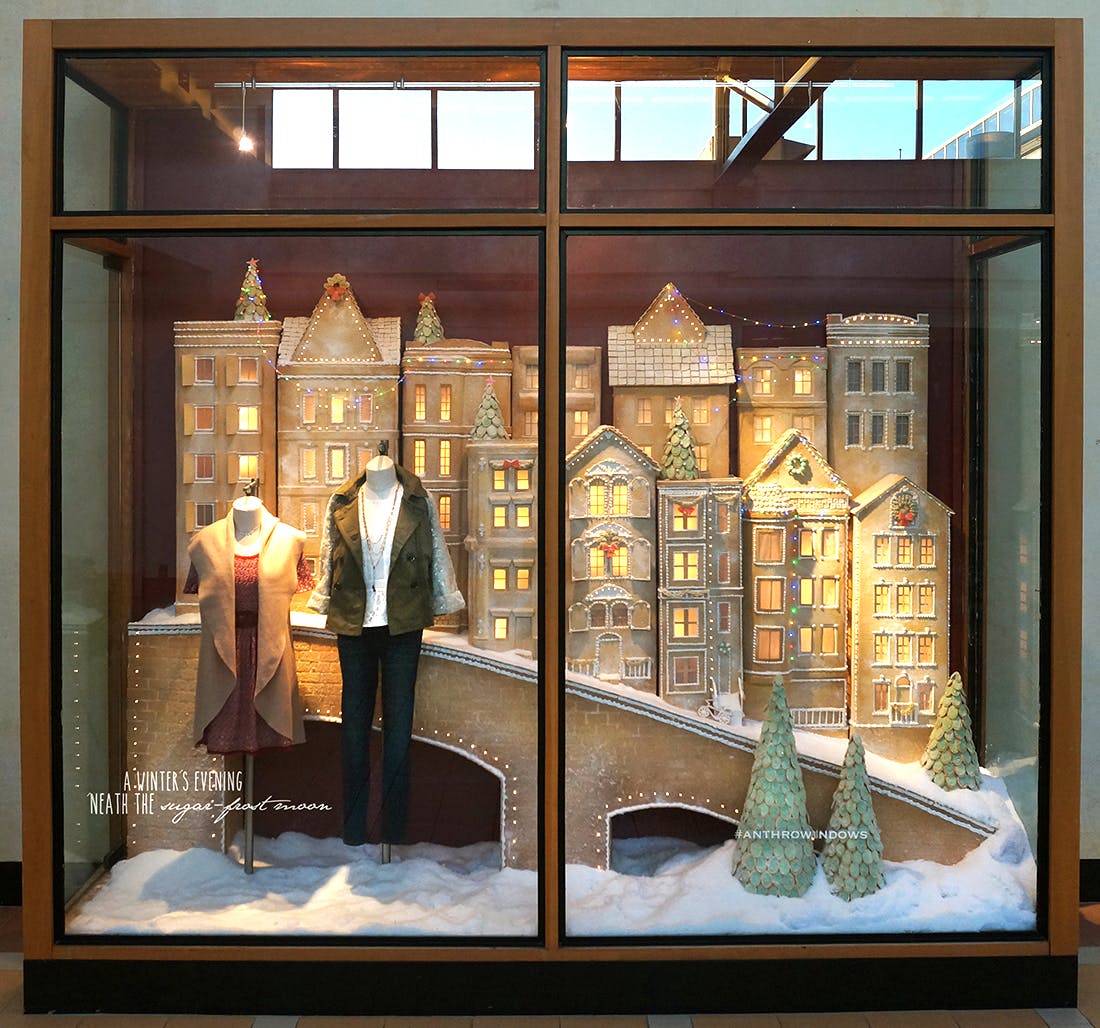
One store that does window displays REALLY well is Anthropologie.
They're like giant dioramas, displaying their product with as much detail as a museum display.
I went to college on the same block as one of their stores, so I would walk by their windows almost every day.
They would regularly have amazing new displays being installed. They were hand-made, intricate, time-consuming, and painstakingly detailed.
Oftentimes it was just as cool to stand outside and watch the employees set up the display as it was to view the finished product.
I also found myself anticipating when the next window display would get put up, just to see what they would do next.
This is a company that understands the value of good DESIGN.
They understand that it's SO much more than simply looking good. They understand that good design is often the deciding factor for a person to give them a chance to sell something.
Now think about all of the other companies on the same city block who aren't making use of good design. Would they stand a chance against a store with elaborate, beautiful, curiosity-catching window displays? Not likely.
People don't buy products, they buy EXPERIENCES.
Think about the stores that you enjoy visiting. And I'm not talking about necessities, like the grocery store, I'm talking about the ones that really create an EXPERIENCE that you enjoy.
What is it about those businesses that draws you in and makes you trust that they are legit and do what they do well?
The lighting, the graphics, photography, catchy taglines...?
Become aware of WHY you step into those stores but walk past others.
They probably show you that they have what you want, they make you feel good, they capture your imagination.
Now think of ways that you can borrow their strategies and ideas to raise the level of design and presentation for your own business.
You might not have a physical storefront, but you probably have a digital one:
Your website and/or your social media.
Any public-facing part of your business can be considered part of your "storefront".
Here are 5 "storefront windows" of your business that need to be customer-catching:
1. Website
The Challenge:
Your business is growing, and now more than ever it’s essential to have a strong online presence that is both personal and beautiful.
An amazing website is SO much more than just a place to display your services; your website is often the only conversation you get to have with potential clients, so it needs to express your aesthetic, voice, personality and vision in a way that gives them the feeling that they know you already.
Your site is an extension of you, and YOU are the reason people buy into your company.
From the viewpoint of potential clients, your online brand IS you. It shows the most relevant and important parts of what you do, who you serve, and especially WHY you love serving them. They don’t get a deeper look at you until you get to speak to them in person – but you only get to speak to them if you can win them over when they are checking you out online.
Clients want to know that you can provide them with the experience they dream of, and the experience they have on your website is an unmissable opportunity to give them an idea of what you’re capable of.
A killer website lends massive credibility to your brand. On the flip-side, not having a beautifully-designed website isn't just a missed opportunity, it's a big LIABILITY because it is often the determining factor in a client’s decision of who to work with.
The Solution:
There used to be a time when you had to know coding, or know someone who knew coding, in order to design your website. It was mysterious and intimidating and expensive; not so anymore!
These days, there are a myriad of amazing website builders out there that you can use to build a nice site very inexpensively. Squarespace is my favorite (it's what this site is built on) because it's extremely VISUAL and a beautifully smooth experience, but there are others like Wix, and of course Wordpress (which has many features but can potentially be intimidating BECAUSE you have so much freedom and power.)
If you're interested, sign up for my free workshop Start With Squarespace to get a quick and simple breakdown of how to build your own Squarespace site.
If you have the budget, you can save a LOT of time by hiring a professional designer to build out your website (this is also something I do), or you can be perfectly successful building it yourself to save money if you've got the patience to devote to it. (You may even really ENJOY the process of bringing it to life!)
Either way, you NEED to have at least a comfortable knowledge of how to run your site personally because it's your digital home-base. – You can't run a retail store if you don't know how to run the cash register, right? Know your tech.
2. Logo
The Challenge:
Your logo is one of the most essential elements of the visual representation of your brand. While it's not everything, it is often the focus and the MOST RECOGNIZABLE part of your business.
A well-designed logo can communicate credibility, style, good taste, sophistication, confidence, and differentiation from your competition.
In the same way, a poorly-designed logo can have the opposite effect. Rather than simply having a neutral effect, it can actually TAKE AWAY from your brand's credibility.
Even if your whole business is amazing, if you've got an ugly/outdated logo or one that isn't relevant to your target audience, it can cause them to wonder, "If they care so much about their customers and their work, why don't they care about their own logo?"
The Solution:
Is a beautiful logo the MOST important part of your business? NO. I would say that before you make anything LOOK beautiful, you've got to make sure your PRODUCT and your HEART behind how you serve your customers is top-notch.
That being said, your logo is the FOCAL-POINT for people to know who your business is. It's basically the FACE of your business: how people recognize and remember you.
A well-designed logo will be modern, simple, quickly-recognizable, looks just as good in 1-color as it does in full-color, looks good at any size (whether it's 1/2 an inch on a business card or 20 feet wide on a banner)
While I am a huge advocate for small business owners to have an essential understanding of design skills so you can run your own marketing and take care of your base needs until you can outsource, I believe a logo falls into a different category. I would HIGHLY recommend you hire a professional designer to create your logo.
When it comes to design, you often get what you pay for. There are a ton of places online where you can get a super cheap logo designed by some random person on the other side of the planet, but the problem is that it won't be personalized to you; and that's kinda the whole point of a logo.
Doing this would be akin to hiring a personal stylist but never meeting them face to face or showing them any pictures of yourself. There's no way that it's going to be a true and unique expression of your business.
While there is an acceptable threshold for most of your presentation while you're still growing, once you are ready to invest in design, getting a well-done logo would be one of the first investments to make.
3. Social Media
The Challenge:
This one is a whole other animal unto itself. And while I'm not a social media expert by far, I have been a professional designer for 12+ years and I have an intimate knowledge of the visual presentation of a brand.
You cannot neglect social media as a business owner. It's where the people are. It's where the conversations and referrals happen. It's an unprecedented opportunity for you to succeed in ways that have never been available before.
Be careful of where you get advice. There are a billion "social media experts" out there who don't have real-world success. If they are really an expert, then they should have a large following, sizable income, testimonials from clients, and a track record to prove it. – A tree is known by it's fruit.
The Solution:
You know that you need to post consistently on social media, but you also need to make sure your posts themselves are consistent.
The visual style of your social media should be an extension of your overall brand. If someone goes from your website, to your Instagram, to your physical store, to your blog, everything should feel cohesive in terms of color, fonts, photo styles, layout, the language you're using, and the overall vibe.
Get a PLAN for your social media. Beautiful design and successful communication doesn't happen on accident. You won't gain the kind of traction you need to gain momentum by winging it each day for your social posts. (In all transparency, this is something I'm STILL working on for FR.)
It can be intimidating at first, but it doesn't have to be. And the best news is that we don't have to reinvent the wheel; there are amazing people out there who are extremely generous with their knowledge.
Get good advice from people who are crushing it. Here's 2 of my favorite people/resources:
Jasmine Star - Social Media Mastery
Gary Vee - Crushing It
4. Business Documents
The Challenge:
Often an overlooked part of the customer experience, your business documents can communicate a TON about your business to your potential and current customers.
Sadly, many business owners miss this opportunity by using stale, outdated, uninteresting documents for their businesses. What good is a proposal, resume, contract, or invoice that is so stale a client doesn't even want to read it? How many opportunities get missed because our client's experience is just BASIC?
Your business documents are an essential part of CUSTOMER SERVICE.
And excellent customer service can mean the difference between being able to charge $1,000 or $10,000. It can mean the difference between someone buying from you ONCE, or becoming a lifelong loyal fan of your business.
SO many businesses differentiate themselves solely on their amazing customer service. They do the stuff that isn't necessary, but it's essential to building loyalty, trust, credibility, and lasting relationships with customers.
An intentional business owner cares about EVERY interaction a person has with their brand.
The Solution:
Make your documents look nice and make them easy to comprehend. It's such a simple concept, but easy to mess-up by cramming in too much information or getting lazy and throwing together a hastily-assembled email.
I carry good design into every document that I send to my current and potential clients, but I put special emphasis on my proposals. Why? Because nothing else matters if you don't win the job in the first place.
Many people in the client services industry don't think of their proposals as an advertising/pitch document.
Sure, it's easy to just jot some quick notes with a quote in an email to a client, but that's not how you stand out from the crowd. I intentionally make my proposals a beautifully-designed visual experience for my potential clients. These proposals have helped me win numerous 5-figure projects over the years.
If they are well-designed, easy to use, and personalized, then it communicates that you are professional, intentional, and care about even the smallest details.
If a client gets three proposals for $5,000 from three different people who all have comparable experience and skills, how do they choose who to work with?
Well, if ONE of those proposals is a beautifully-designed PDF document with nice typography and images, but the other two are a Word document and a bullet-point list via email, then it's a no-brainer who they will likely choose.
They will think, "If they are this detail-oriented and focused on excellence in their own business, how much more will they be able to serve ME?"
5. In-Person / Physical
The Challenge:
This encompasses any physical interaction a person might have with your business, be it a printed promotion, your actual storefront, your company vehicle, and even how you dress.
It might be the most intuitive and natural out of the 5 items on this list because, from a very young age, we learn that looking nice is important. People like to talk to people who look good. We like to be in beautiful places. We like to buy well-designed products.
You don't have to be perfect, but it will absolutely be a huge asset to "design" the in-person experience someone has with your business.
The Solution:
Look for untapped opportunities to create a visual experience. (Read what I wrote about Anthropologie above for a refresher if you need to.)
How can you dress to express yourself and paint an aspirational picture for your customers?
How can you bring a fresh attitude into your industry? Smile. Treat customers like friends instead of being a stiff professional. Care for them more than you care about getting paid.
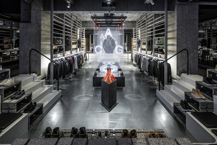
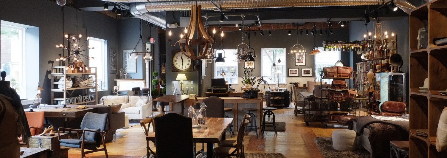
How can you make your store an immersive environment that makes people FEEL inspired, comfortable, relaxed, excited, motivated, or cared for? Is it displays, graphics, paint, furniture, music? All of these decisions fall into the realm of "design".
Look at how your competition are presenting themselves. How is everyone else doing the same thing, and how can you do it differently, more personally, or better?
The way you design your in-person interactions will be unique to your industry, but you can learn from those who are zigging when others are zagging in other industries and apply those core concepts to your own.
I realize this last item goes beyond just visual design and into more personal aspects, but understand that the end goal here is to create a complete experience for your customers. When you make it a priority, the mindset of intentionally beautiful design will naturally spread into every facet of your brand.
As a rule of thumb, it's all about bringing EXCELLENCE into every aspect of your business.
"But I'm not creative like you."
Allow me to politely say, "Bullcrap".
If you are a business owner, you ARE creative. You've created a freaking business out of nothing!
Being an entrepreneur is one of the most challenging professions out there. You've got to be creative, adaptable, resourceful and inventive.
Trust, me, even if you're just getting started, the fact that you've taken the big step into running your own gig is proof that you've got what it takes to completely own your business presentation and take your design to the next level.
Have some faith in yourself!
NEXT STEPS:
3 ways to get great design for your business
(READ BELOW)
You've got 3 main options for design:
1. Hire a professional designer
= Save Time + Energy, Spend more Money
If you have the budget, this can be one of the best investments you can ever make in your business. I'm speaking from experience as a designer who has helped many clients flourish and get big-wins as a result of our working together.
Chances are if your business is a little more established, and you have decent cash flow, then this is going to be the best option for you because it will save you the most time by a long shot.
When you've got momentum going, you'll reach a point where your time is just as, if not more, valuable than money. Add that benefit to the high level of execution a pro designer can provide and it's a win-win.
If you aren't quite at the place where you've got a budget to afford to hire a designer, then one of the next two options will be a better fit for you.
2. Teach yourself Design (AKA "Bootstrap it")
= Save Money, Spend more Time + Energy
This is by far the most cost-effective option, and the best option if you don't have ANY money to invest in your business yet. But it's also the most time-consuming since there can be quite an intimidating learning curve for design and the software that comes with it.
A great benefit of this approach is that you are investing in YOURSELF, not just your business.
You are teaching yourself skills that you can use for YEARS to come; not only that but you will have a hands-on understanding of design that will make it easier to work with and articulate your ideas to designers in the future when you grow big enough to hire them.
This option is for those who are literally just getting started and have zero budget, OR for those people who can afford to spend the TIME (dozens, if not hundreds of hours), OR for those who genuinely want the skillset AND don't want to spend a dime.
3. Have a professional teach you (AKA "The Combo")
= Spend a little money, time + Energy, save a LOT of Money, Time + Energy
For those of you who want to learn design skills AND want to save yourself LOTS of time and headaches, you can spend a little bit of money to have a professional teach you what you need to know about design.
They can save you hundreds of hours you would have spent teaching yourself. That frees up more time that you can dedicate to client work AND allows you to start getting the benefits of great design sooner than later.
You can also save thousands of dollars you would have spent hiring a designer to make everything for you. This allows you to invest more money into your business and to save up for the bigger projects that actually require a professional designer's expertise.
I would argue that you could create up to 90% of the designs you need in your first years of business by learning about 10% of the essential skills.
This is the best option for a business owner who wants to have the empowerment that comes from running their design themselves and connecting directly with their customers, but they also want to be cost-effective and save the maximum amount of time in the process.
Traditionally, this kind of professional education comes in the form of workshops or courses, where an industry pro distills down years of knowledge into highly-focused lessons so you can learn what they know very quickly.
These courses aren't necessarily cheap (they can run anywhere from a few hundred dollars to a few thousand) but compare that price with the amount you would spend hiring someone and it's a VERY good deal.
This is one reason why workshops and courses are so popular; it's because people understand that by investing in themselves, they (and their business) become more valuable, and they can make more money and get higher-quality clients with their new skillset and top-notch brand presentation.
If you have a bit of a budget to invest in yourself/your business/your education but aren't quite at the level where it's sustainable to outsource your design to a pro, you'd be hard-pressed to find a better option.
I hope this article has proven helpful for you and opened up some new perspectives on the importance of design and presentation. This stuff can be a GAME CHANGER for you.
Best of luck!
🔥 – N
If you're wondering where to get training like option #3, I've been creating something that you're going to love.
It's called Portable Design Academy
A simple, time-efficient, and cost-effective online course to empower small business owners who can’t afford to hire a designer to personally create beautiful graphics for your business.
If you're ready to get the "window shoppers" out there to stop hovering outside and step through the door to becoming customers, this is for you.


